Next information sessions Heading link
Public health degree programs Heading link

Our latest efforts Heading link

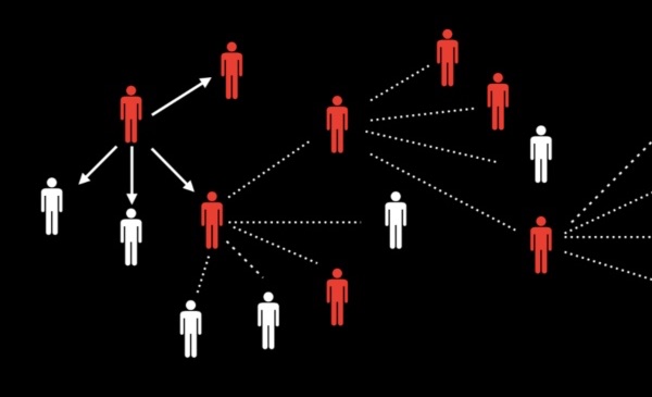
Policing and public health Heading link

Residents of Columbus, Ohio walk down a street as a group protesting the death of George Floyd.
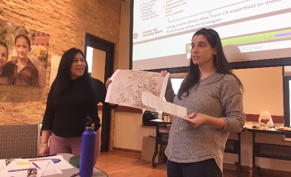
Community engagement Heading link

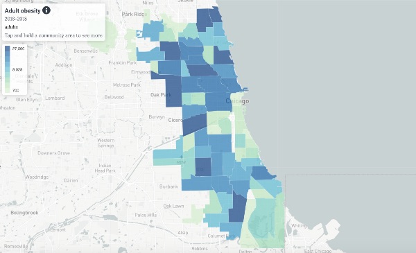
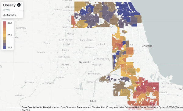
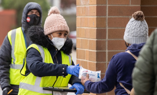
Democratizing population health data
Population health data links

Advancing health justice
Public health isn't an action performed on others
Community capacity examples

Global health Heading link
SPH Program in Kenya
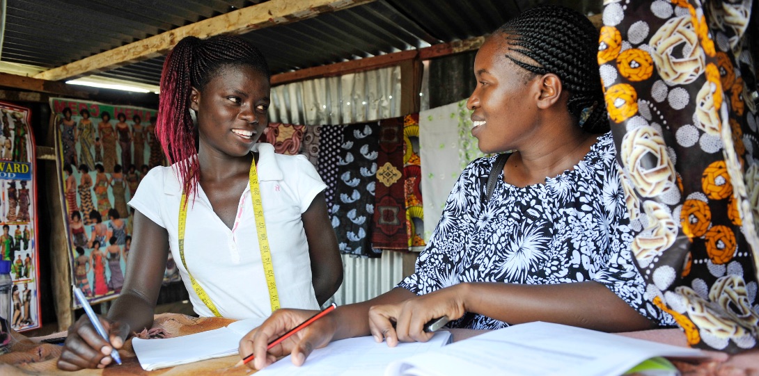
SPH students travel to Kisumu City each year, working with community partners on HIV/AIDS interventions, sexual and reproductive health, safe water access, interpersonal violence, tobacco cessation and LGBTQ health.
Learn More About SPH Program in KenyaSPH Program in Mexico
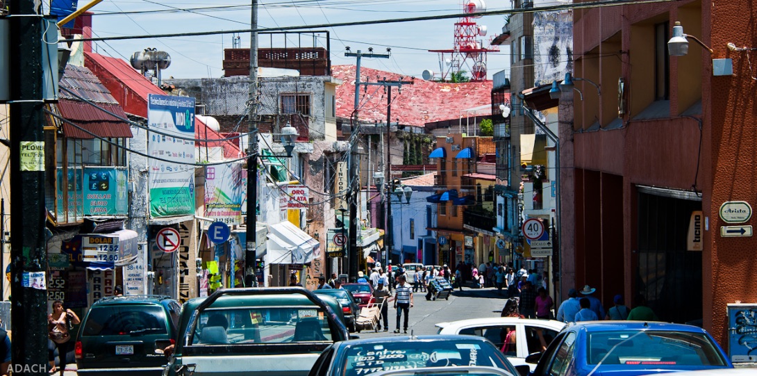
In partnership with Instituto Nacional de Salud Pública, SPH students travel to Cuernavaca, capital of Morelos state, to work with community partners addressing community health challenges in the region and country.
Learn More About SPH Program in MexicoWorld Health Organization Collaborating Center
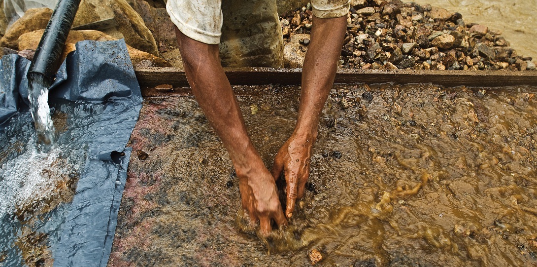
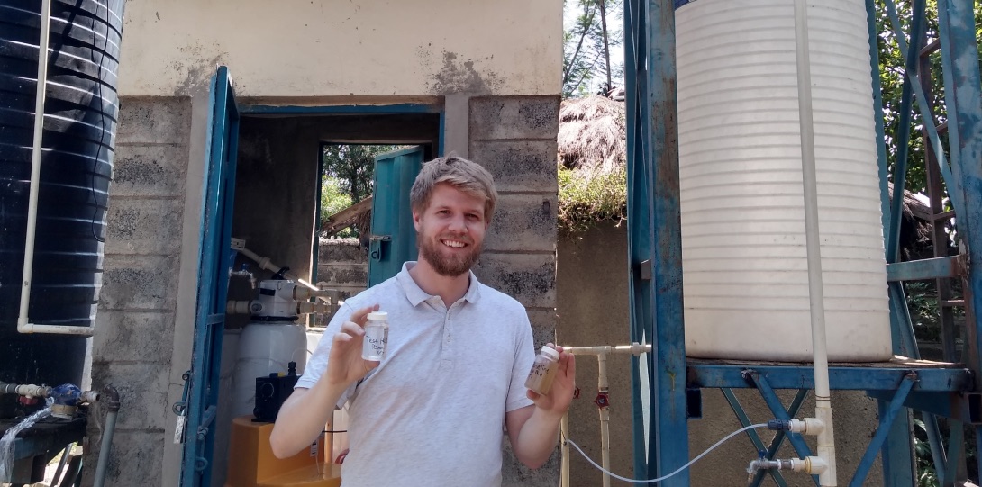
SPH's World Health Organization Collaborating Center focuses primarily on occupational and environmental health and is a global leader in training occupational health practitioners to address the health and safety needs of informal workers around the world.
Learn More About World Health Organization Collaborating CenterGlobal Health Research Portfolio
SPH leads the way in developing and testing interventions and programs to investigate causes of disease, improve health and deliver acceptable, feasible and affordable services. Underlying our efforts, we prioritize equity, compassion and idealism as we address health equities and human rights worldwide.
Learn More About Global Health Research PortfolioEnvironmental justice Heading link


Take the next step Heading link
Image credits Heading link
Home page image credits include:
Richard Hurd © Creative Commons
Peter Dahlgren © Creative Commons
Randy von Liski © Creative Commons